Where has the forest changed?
We compared satellite images from 2019 and 2026 to find places where tree cover may have been lost. We then ranked those places, so the most reliable ones can be checked on the ground first.
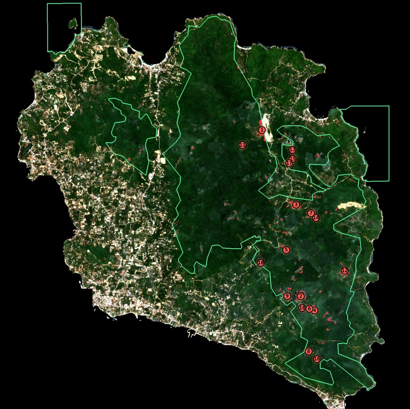
What this does
This is a screening tool, not proof of forest loss.
It uses freely available satellite images to look for places where tree cover may have decreased around Than Sadet–Ko Pha-ngan National Park. The satellite images show where something may have changed. They cannot tell us exactly what happened, who caused it, or whether it was legal.
Each location needs to be checked on the ground.
2019 and 2026
These two images show Koh Phangan in 2019 and 2026. For each year, we combined several clear satellite images from the same dry-season period into one image. This makes the comparison more consistent.
Sentinel-2 · 10 m pixels · about five clear dry-season images per year.
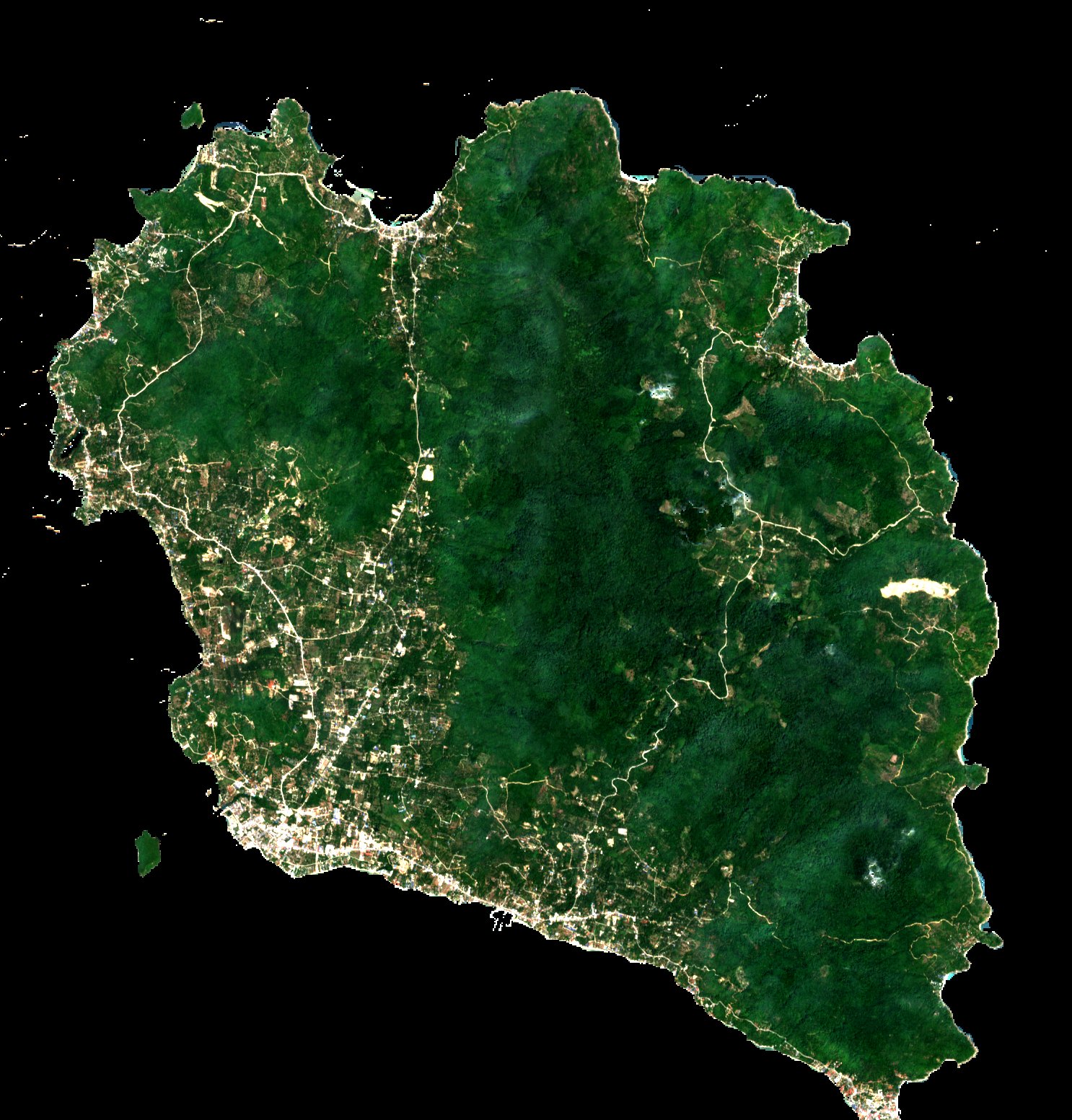
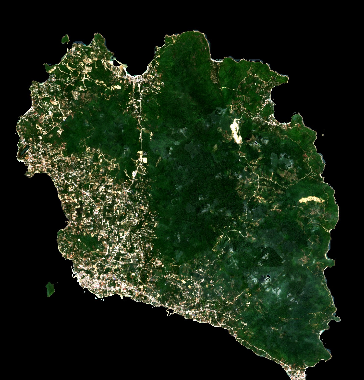
We compared the two images to find places where tree cover appears to have decreased. These are possible changes, not confirmed forest clearing. They still need to be checked on the ground.
We found 31.2 hectares of possible change across 18 locations large enough to include in the field-check list. Another 26.6 hectares showed smaller or scattered changes, so these were not turned into separate locations. The 57.8-hectare combined figure is not a measure of forest loss. It is simply the total area of pixels that showed some decrease in the satellite comparison.
What you can do here
Why these locations are ranked this way
The first locations are the ones that are clearly inside the mapped park area and show the strongest satellite changes. Locations close to the mapped boundary are kept separate because the boundary is only an approximation. A ranger could reasonably choose a different order depending on what they want to check first. The rule is stated here so it is clear and can be changed if needed.
How it works
- i.Compare satellite imagesWe compare images from 2019 and 2026 and look for places where tree cover appears to have decreased.Sentinel-2 L2A imagery, 10 m pixels. About five clear dry-season images were combined for each year.
- ii.Find the areas that stand outNearby changes are grouped into individual locations. Very small or scattered changes are left out of the list.Only groups covering at least 0.1 hectares (10 pixels) are included as locations.
- iii.Check each locationEach location is checked against the available park boundary and the strength of the satellite change.Locations are classified as High or Medium signal and measured by their distance from the mapped boundary.
- iv.Make a list to check on the groundThe clearest and most reliable locations are placed at the top of the field-check list.The ranking uses boundary distance first, then signal strength, then size.
- v.Check what is actually thereSatellite images can show that something changed, but they cannot tell us exactly what happened. A closer look at higher-resolution imagery can help, but a field visit is what confirms what is actually there.
The field result is recorded as:
Confirmed · Not confirmed · Cannot tell
A “not confirmed” result is useful too. It tells us that the satellite signal did not match what was found on the ground, which helps us understand how reliable the method is.
Known limitations
There are a few important things this map cannot tell us.
The park boundary is approximate
We could not find a reliable public digital map of the legal park boundary, so the boundary used here is an approximation. We tested what happens if that line is wrong by 100, 250 or 500 metres. At 250 metres, 9 locations covering 14.8 hectares remain inside the mapped area, while 9 could change classification depending on where the true boundary lies.
Two years cannot tell us why the change happened
We compared 2019 with 2026, but vegetation can change because of weather as well as land clearing. A particularly dry year, for example, can make vegetation look different in satellite images even when no clearing has happened. This project is designed to find possible sudden changes, not to measure long-term forest trends.
The satellite image cannot tell us what caused the change
Fire, exposed soil, harvesting, plantations, construction, shadows and other changes can produce similar signals. The satellite tells us where something may have changed, not what caused it.
The locations need to be checked
No location is treated as confirmed until someone checks it. A field visit can show whether there is actually visible change, what caused it, and whether the satellite detection was correct.